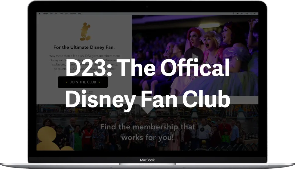
D23 Membership Page
UX/UI Designer
Involvement
In the fall of 2018 I worked with one other UX designer under the guidance of the digital production manager and senior marketing manager of the D23: The Official Disney Fan Club team.
Goal
Explore how D23.com can improve the "Membership Information" page to successfully and pleasantly market their membership.
Identify pain points of current D23 Membership Information page
Competitively analyze the online presence of other Disney services
Compare & contrast online presence of subscription services similar to D23
Pitch a redesign of the D23 Membership Information page based on findings
Competitive Analysis
My design partner and I did an in-depth analysis of internal Disney and indirect external subscription competitors. Please contact me at carolyn@diloreto.com to view this deck.
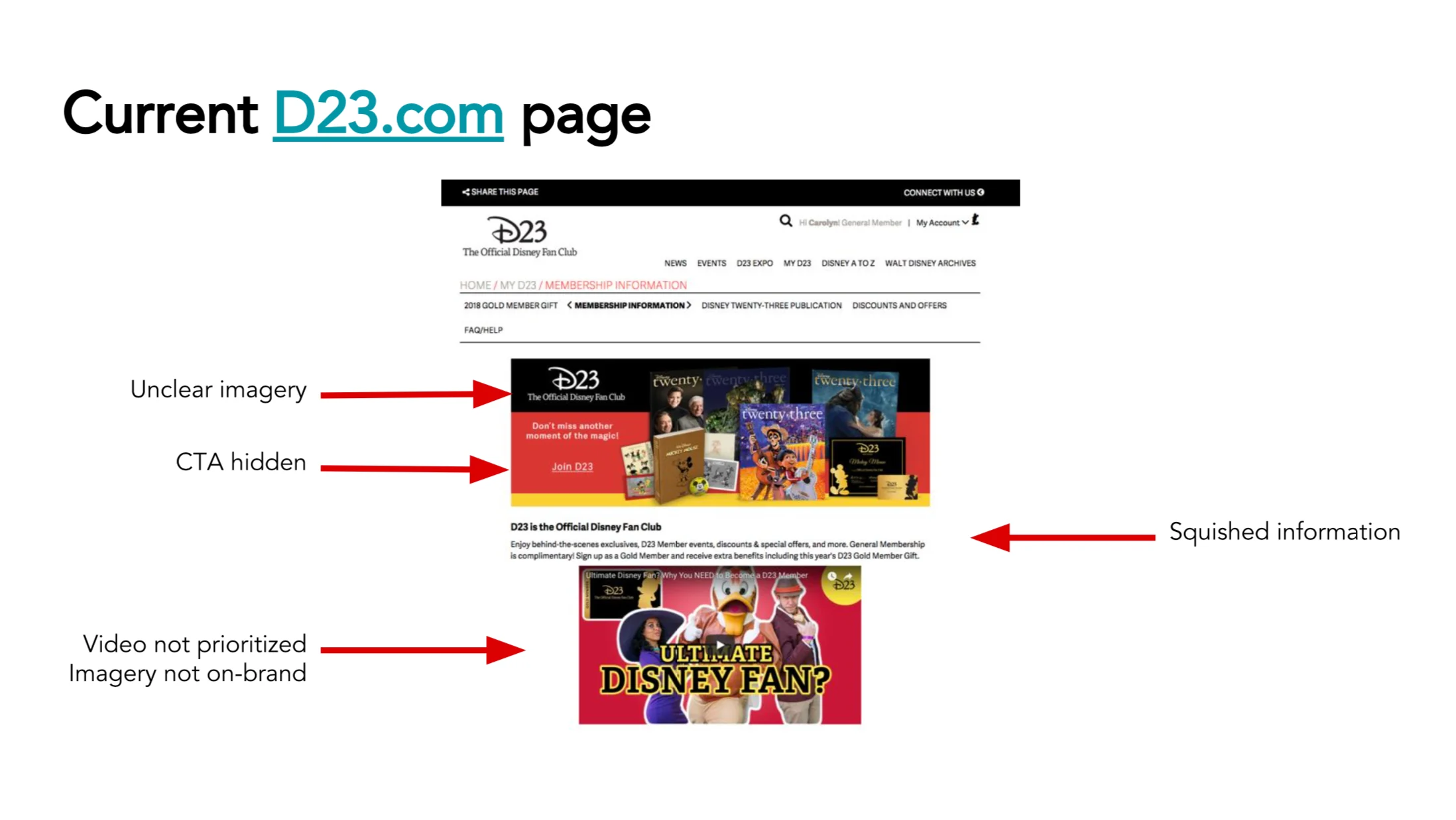
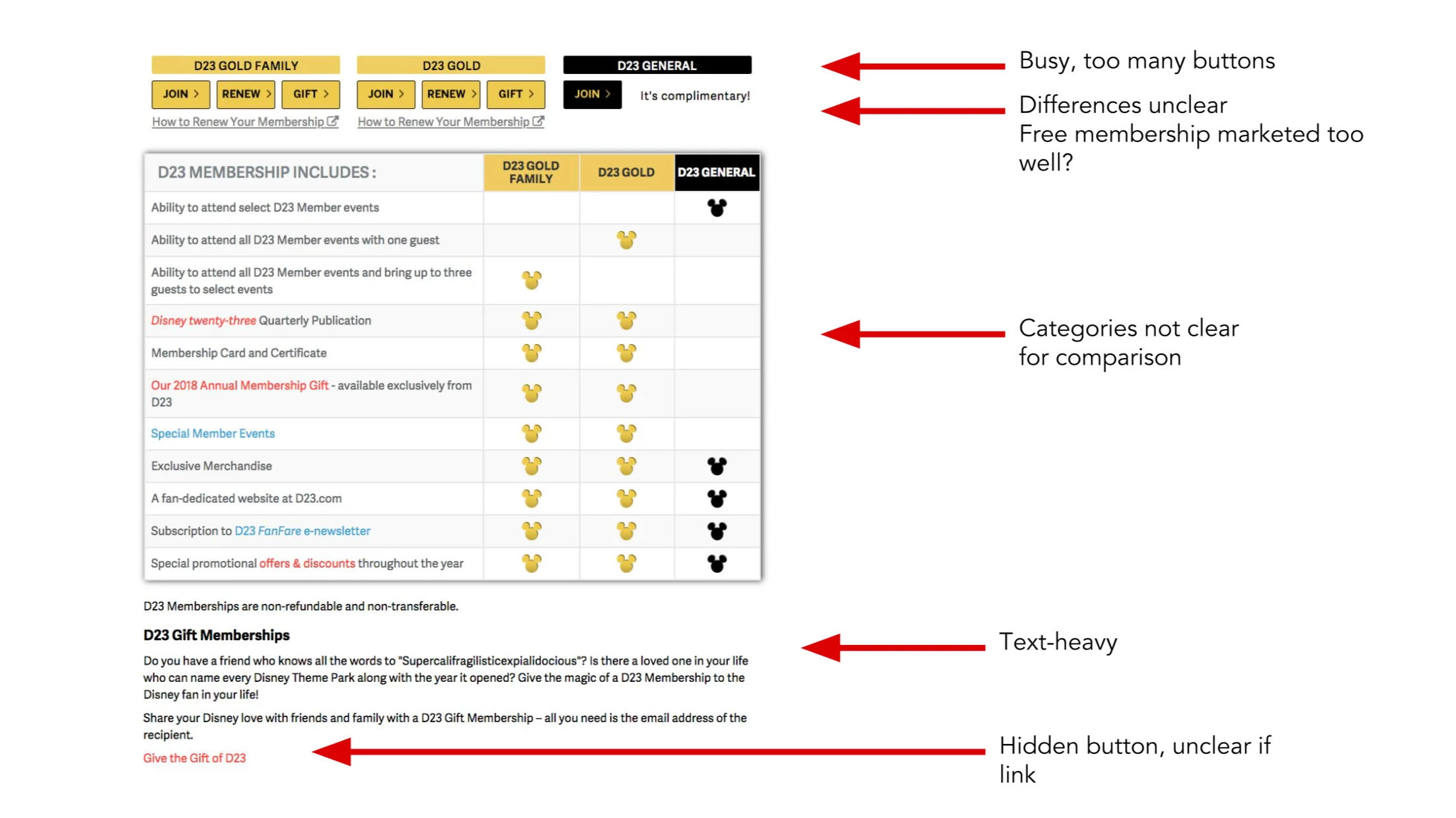
Paint Points
We identified several paint points of the D23 site that was live at the time to see what opportunities we had to improve user experience.
Process
After pitching our competitive analysis and then meeting with the marketing team to understand the priorities for membership conversion, my design partner and I collaborated on a few versions of wireframes. Our takeaways from our analysis were to focus the audience toward new members who aren't familiar with the brand, make the CTA's clearer (through size, positioning, and white-space), prioritize content by making the video top-priority, break the D23 benefits into digestable chunks, and use iconography and lifestyle photography to exhibit the brand and comprehensively display benefit information. After finalizing a layout, we produced a few variations of "re-skins" for specific D23 campaigns.
Result
Click here to view live project.